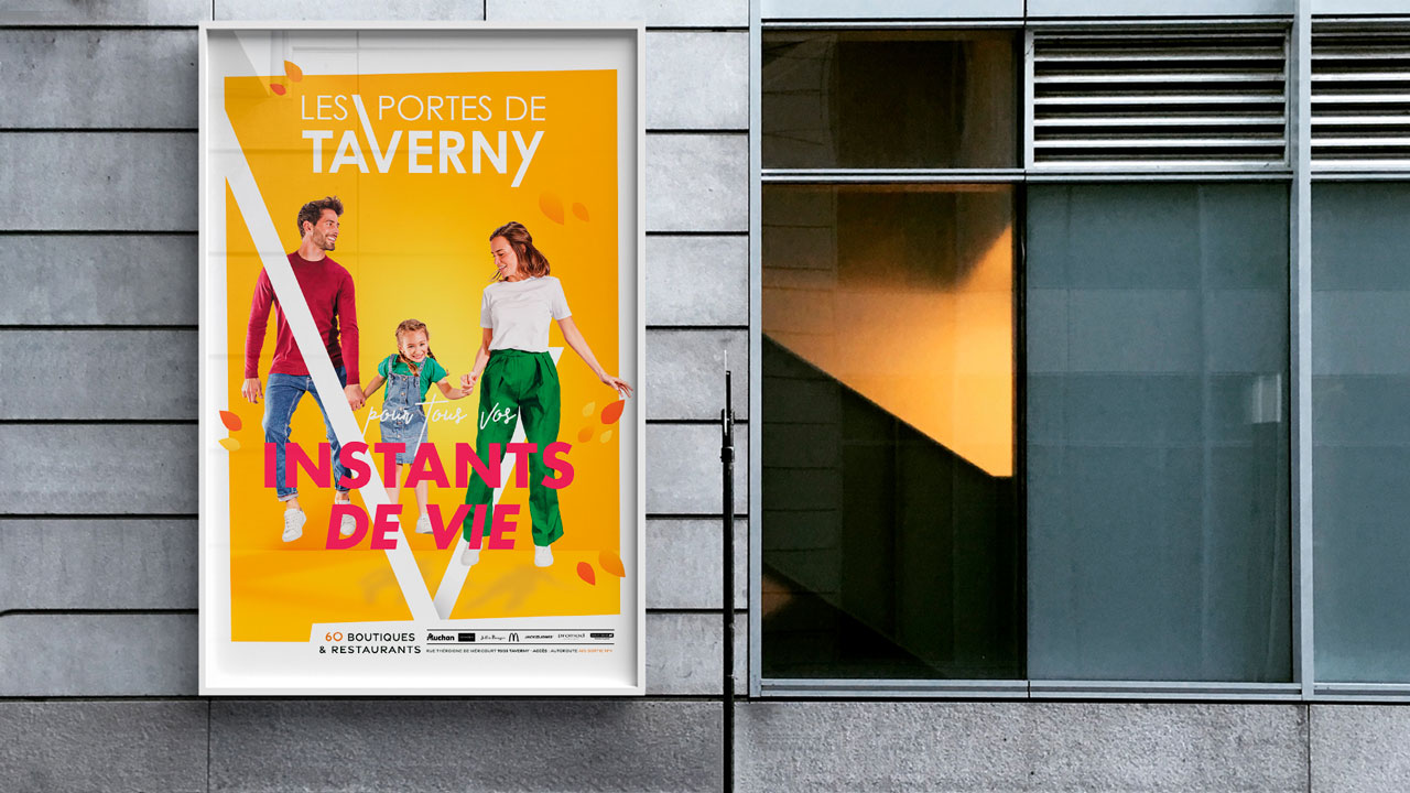
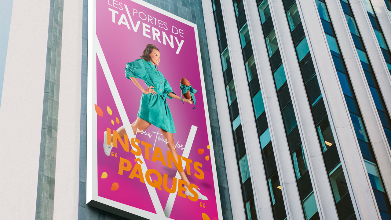
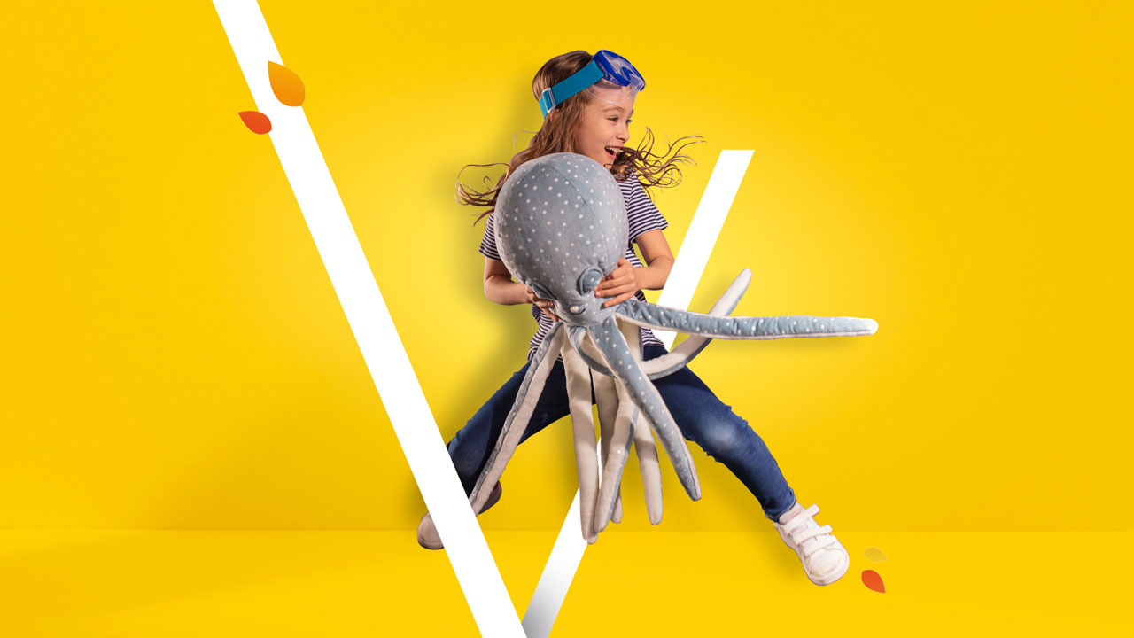
Standing out from the competition, being recognisable and establishing a new identity without totally cutting off the past, such is the challenge for many brands. The agency accompanied Les Portes de Taverny in this design update, its new visual expression having the final objective of attracting a new clientele.
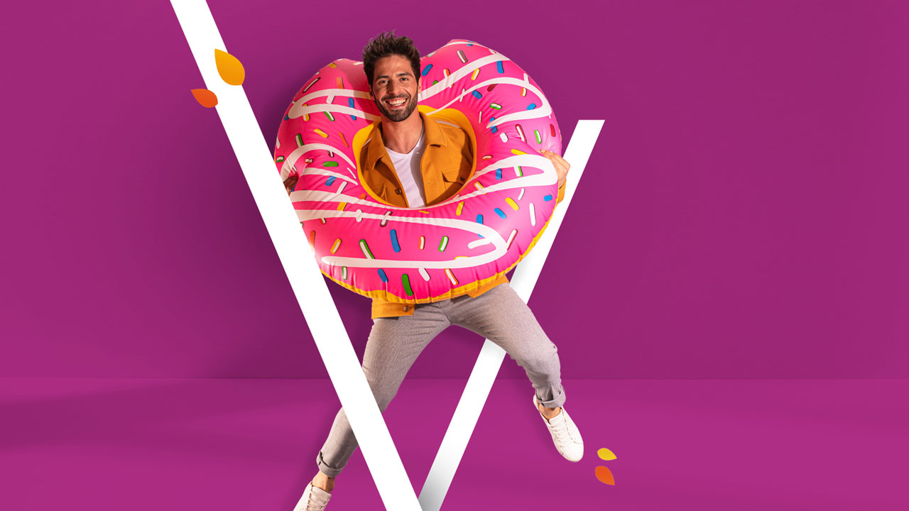
The need for this commercial centre located close to Paris was to modernise its image, being up-to-date with trends in the sector and putting itself on a competitive level which is continually increasing. The global design was based around taking a shopping break for a young, urban target with a visual translation corresponding to the location’s DNA. Graphically, the elements reprise the strongest emblem of a brand – its logo – and are easily adjusted for all media and all formats. This storytelling was brought to life thanks to a photo shoot and the creation of visuals for off- and online media according to the media campaigns which have taken place throughout the year, according to the busiest times commercially.

brand
project
Visual identity creation and deployment
