Combining perfect coffee taste and eco-design approach
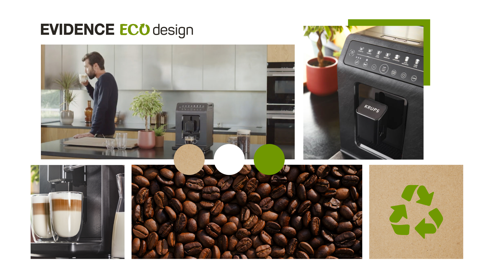
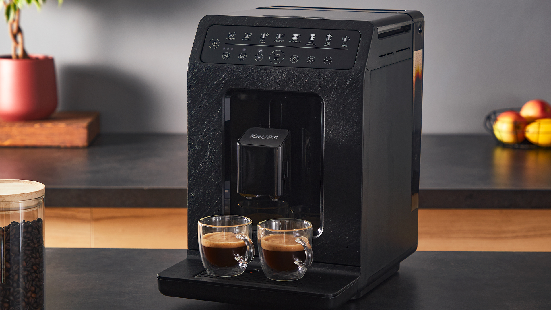
Between KRUPS and The MUZES, it’s been a long story since 2015, through the conception and creation of editorial, video and photo content to highlight the brand and customers for its range of premium coffee machines with automatic bean grinder. After the Evidence Range and Intuition projects, The MUZES has worked with the brand on the digital side of the Evidence Eco Design product launch: the first automatic expresso machine manufactured in France and eco-designed (made from 62% recycled plastic and up to 90% recyclable) to reduce environmental impact, without compromising on performance or service.
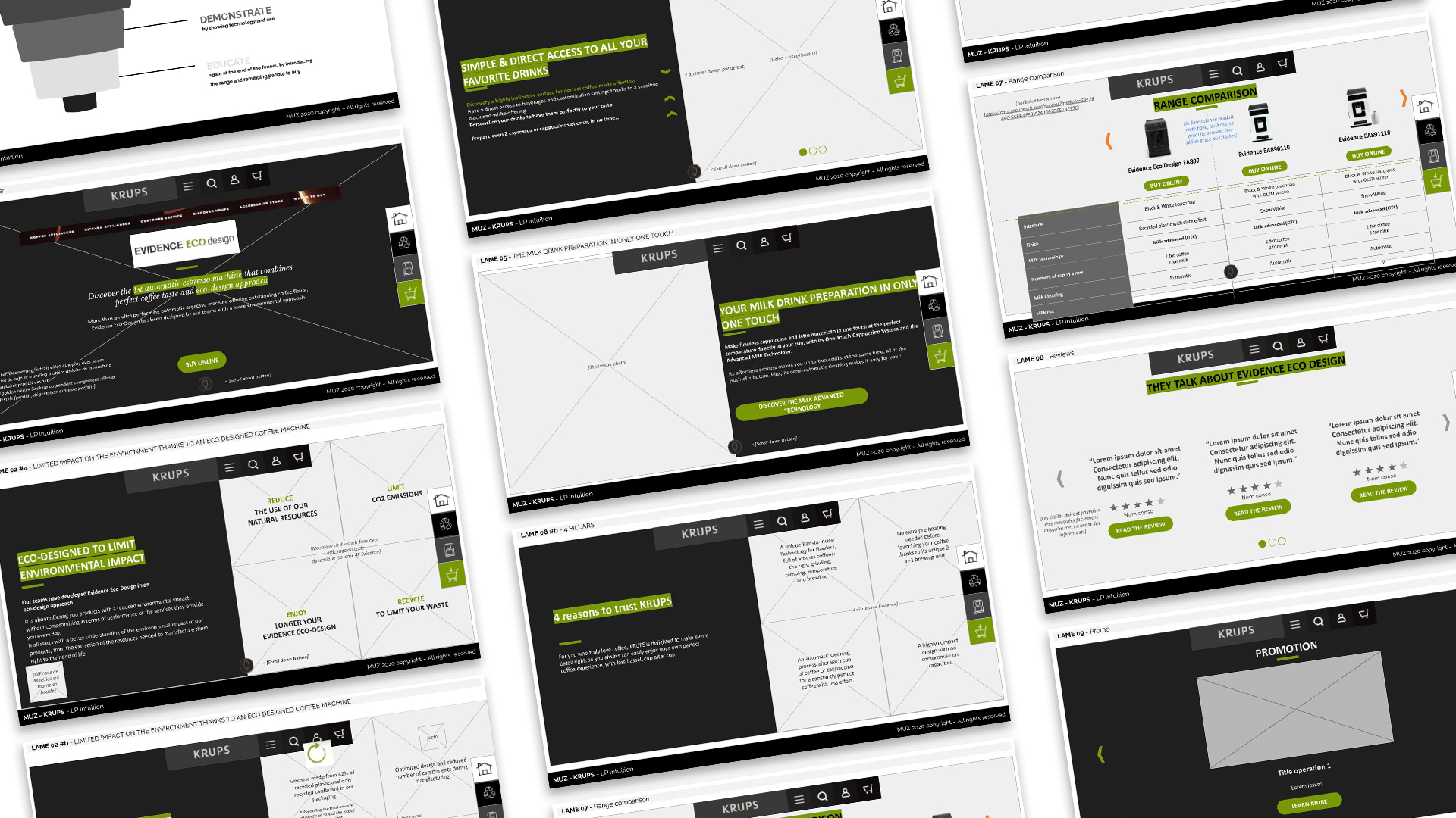
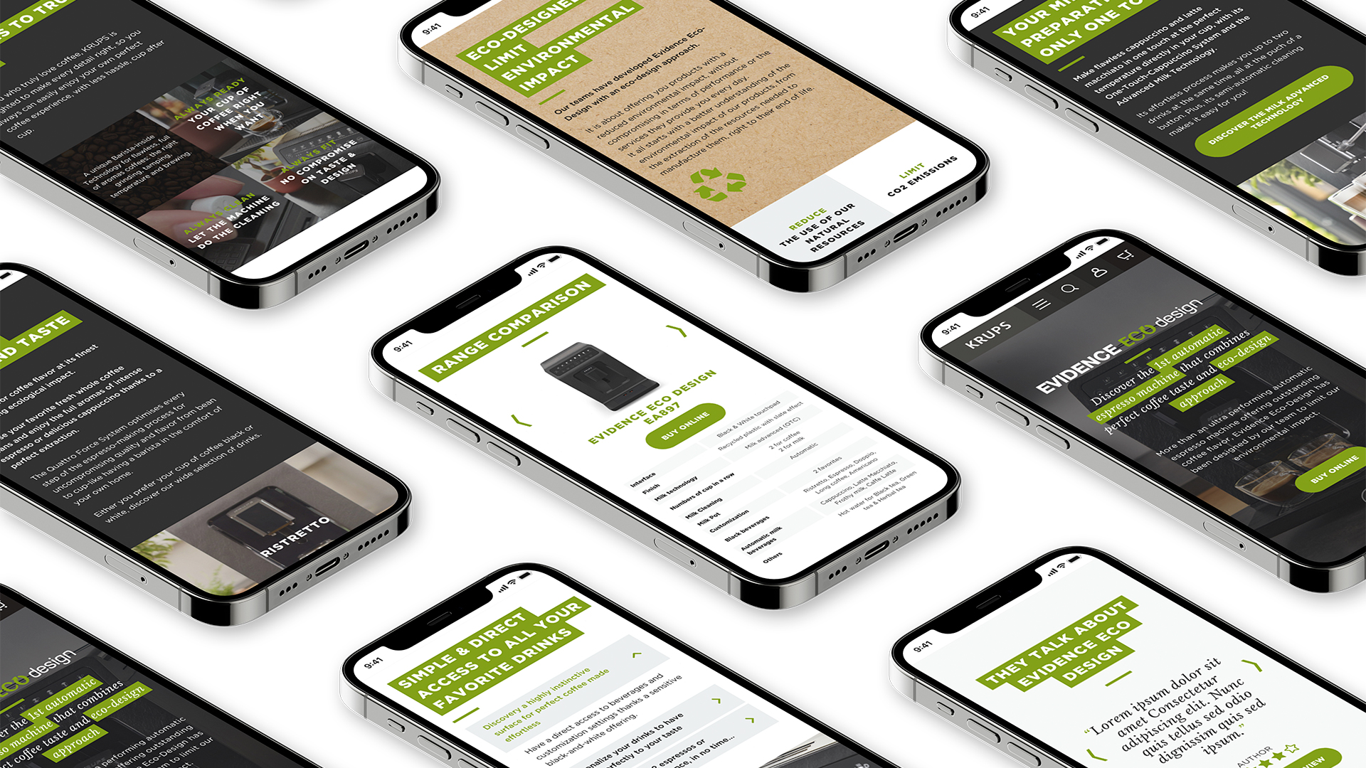
To present and explain this innovation the landing page is the biggest point of contact for customers in the purchase process. The aim? Gather and organize all the content to convey the right message to future customers at the heart of the brand site. The structuring of the speech is done through a simple methodology: inspire, educate in two times, demonstrate. Inspire by transcribing the emotional benefit, educate in a first time by detailing the reasons to believe, demonstrate by showing technology and use, and again educate but in a second time, at the end of the funnel, by introducing the range and reminding people to buy. After this first key design stage comes the web design, development and integration of the landing page into the Groupe SEB technical environment.
The detailed landing page guides customers through their purchase process and helps them understand the eco-friendly approach of the product. As Krups is an international brand, the design of a landing page requires a lot of rigour to facilitate the translation of the content. The Evidence Eco Design landing page is already online in 3 countries: France, Poland and Portugal, and will later be adapted and deployed in several European countries. In the meantime, the Krups teams are already working on a brand new product.

brand
Krups
project
Landing page development

